DESIGN DIRECTION FOR AMPLIFIKA IDENTITY CREATIVE SPOTIFY BR
CCO: Rafael Caldeira / Design Lead: Fabiana Falcão / Designer: Eduarda Nieto / Agency: Soko / Year: 2021
CCO: Rafael Caldeira / Design Lead: Fabiana Falcão / Designer: Eduarda Nieto / Agency: Soko / Year: 2021
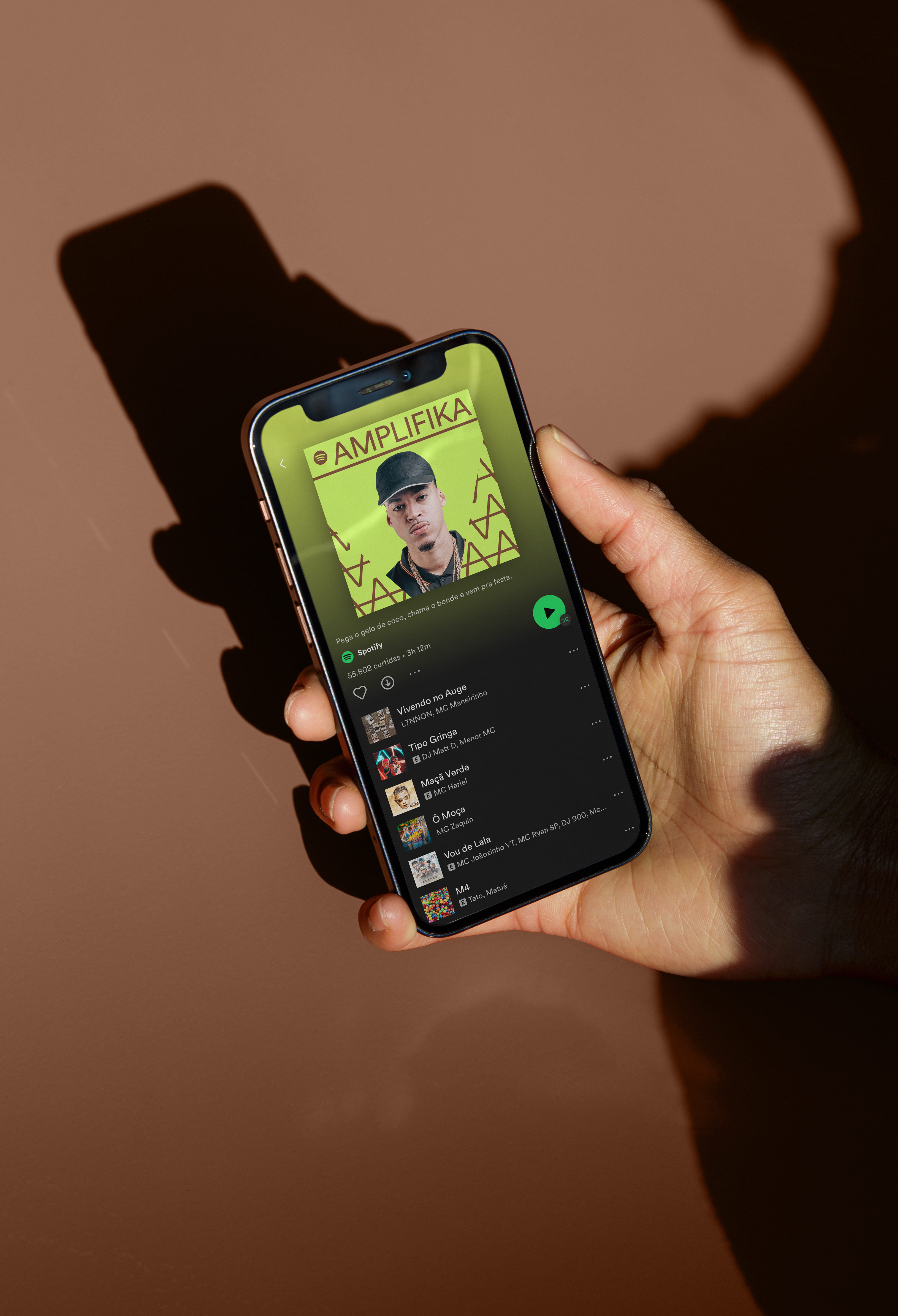
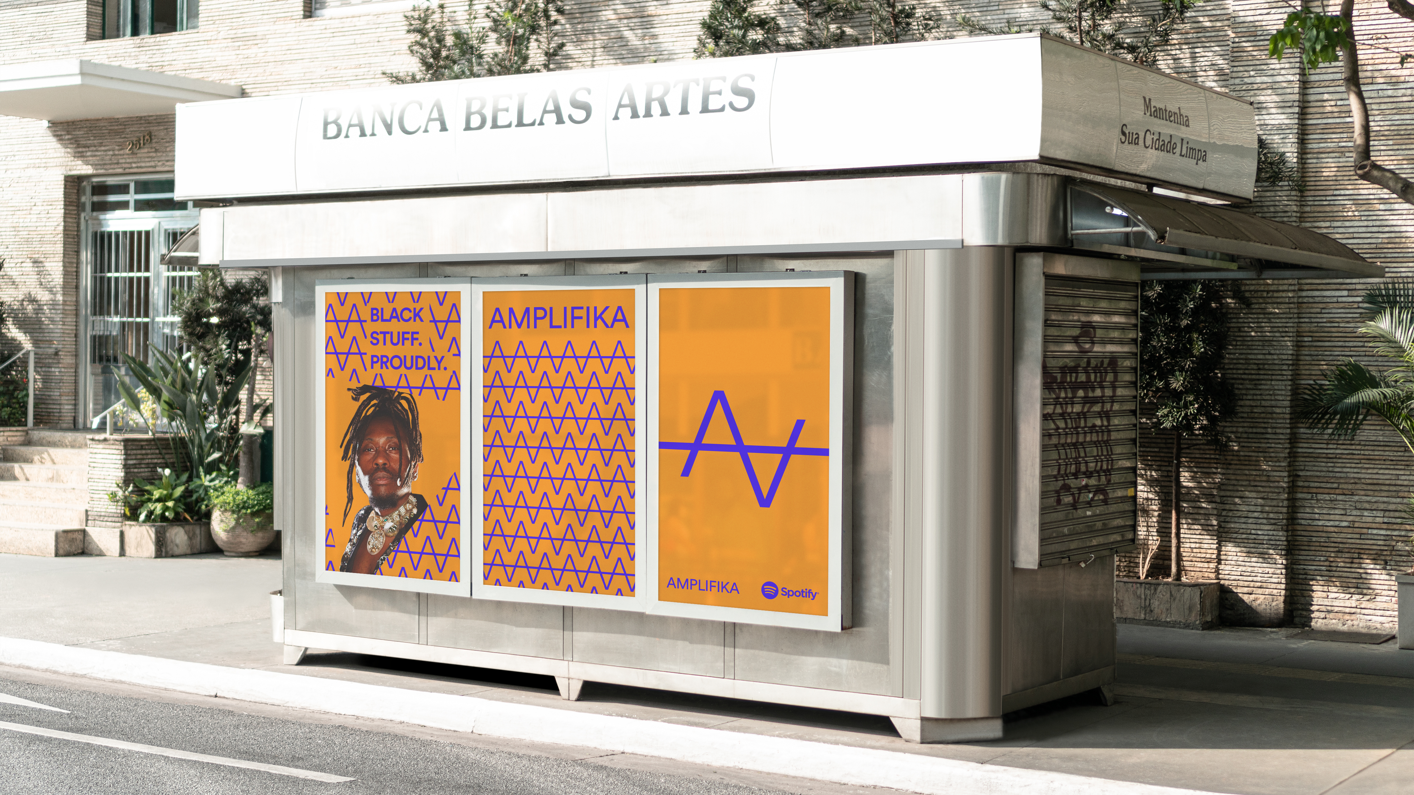
AMPLIFIKA is a Spotify initiative that highlights and celebrates Brazilian Black Culture by positioning the brand as a platform that leverages the Brazilian Black Cultural Product and its creators.
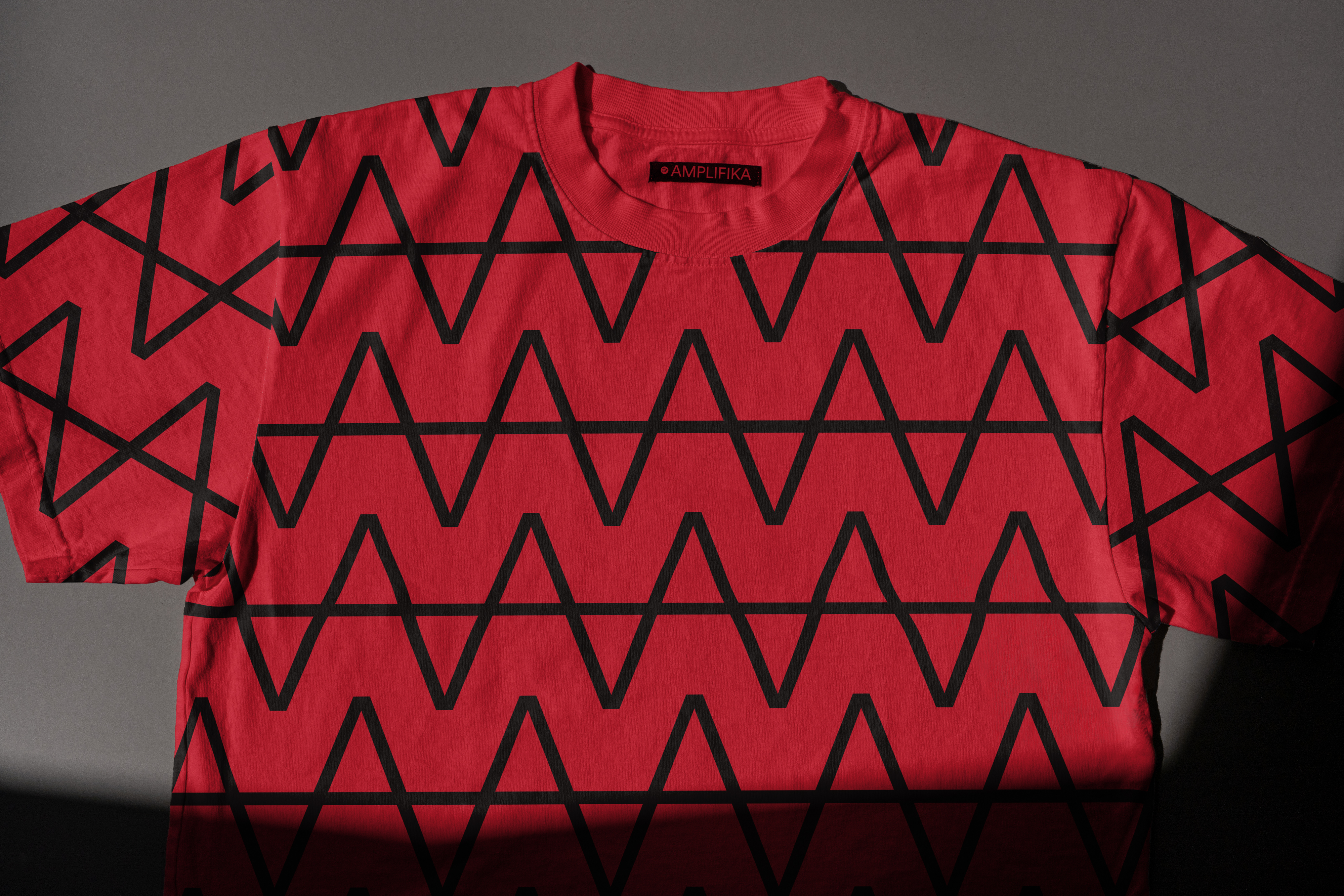
The identity was thought from the meaning of the word amplify, which is the origin of the brand name AMPLIFIKA. The multiplication of the letter A in the design symbolizes the plurality and power of black narratives reverbing. The visual identity resembles the patterns of African textile tradition, essential to connect music to its ancestry and symbologies. In a triangular and expanded form, the frame of the cover photos follows the same concept of these black voices enlargement. Finally, the color palette was based on the Sankofa symbol, a principle derived from the Akan people of Ghana where one should remember the past to make positive progress in the future.
The identity was thought from the meaning of the word amplify, which is the origin of the brand name AMPLIFIKA. The multiplication of the letter A in the design symbolizes the plurality and power of black narratives reverbing. The visual identity resembles the patterns of African textile tradition, essential to connect music to its ancestry and symbologies. In a triangular and expanded form, the frame of the cover photos follows the same concept of these black voices enlargement. Finally, the color palette was based on the Sankofa symbol, a principle derived from the Akan people of Ghana where one should remember the past to make positive progress in the future.